A new year has begun, and with it, new choices in colors to brighten up or add texture and new life to a room or accent area. This year the Pantone Color institute released it pick for “Color of the Year” for 2017, and the choice is a bright, very vibrant shade called “Greenery.”
While the influential Pantone’s choice of this color is certainly significant, those who find the color too strong to use in their home or office shouldn’t be overly concerned. Some of the major paint companies have also announced their picks for the color of 2017, and there’s sure to be a color in the mix to suit just about every taste.
Going Soft And Neutral
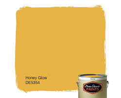 The top color choices from the major paint brands this year are tending towards soft purples and blues (with hints of gray) as well as some interesting neutrals, as well as some yellow tones, like the “Honey Glow” shade from Dunn-Edwards.
It should be mentioned that no homeowner should ever feel that it’s necessary to redo their house in the new “color of the year” simply to keep up with current trends. When a color does become popular, however, it can be easier to find it in furniture and decorative pieces, which is a big plus if it’s a color a homeowner enjoys. Realtors often use popular colors when staging a home for show, and major homebuilders, like Alair Homes Lawrence Park Toronto, may also gravitate towards popular colors when they stage interiors.
Deep Purple
 A dark grayish purple called “Shadow” is Benjamin Moore Paint’s color of the year, and this deep color is certainly beautiful. It’s also a strong color, so it may be best used as an accent, as its depth can overwhelm some smaller spaces.
Soft Purples and Blues
Some of the other purples and blues that are being offered as top 2017 choices are much softer than “Shadow” and have a soothing feel. PG Paints chose “Violet Verbena” as its top choice, and this color is very soothing and clean. “Byzantine Blue” from Gladden is also a soft purple blue that blends well with other neutral colors. “Cloudberry” from Olympic Paint is an attractive light purple that also has gray tones. This is a soothing and easy to live with color that’s great for bedrooms.
Neutral Gray and Taupe
 Neutral tones are top picks for 2017 too, with Kelly-Moore picking “Kettleman,” a soft gray, as its favorite for the year. “Poised Taupe” from Sherwin-Williams is a cool brown tone that’s a nice alternative for those who don’t find gray appealing in a home.
Mellow Yellows
Dunn-Edwards chose “Honey Glow” as its top color, and this welcoming and warm shade of yellow is a sure winner for bedrooms or a kitchen.
As 2017 finds its personality, these colors will help set the tone for interiors and new looks in furnishings. Remember, there’s no right choice in color, but these exciting hues should provide some solid inspiration for the new year.